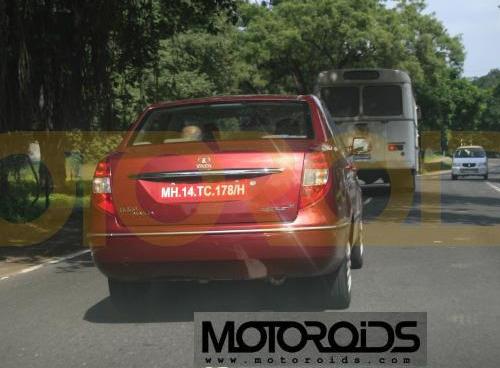
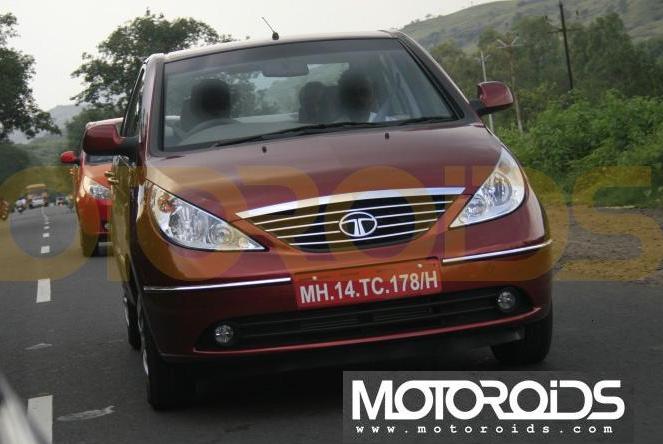
This looks much better than the first generation Tata Indigo, and way better in visual appeal than any of the other Tatas currently on the road. The Indigo Manza was caught undisguised by our friends at Motoroids. On first glance, this looks like the Dzire eater we were all waiting for. The boot is attached to the body in a more cohesive manner and the usage of chrome on the front slabs was deliberately to mimic the Dzire's way of saying "I'm the sedan, not the hatchback."
I think. Easy to identify. That's becoming the industry standard.
The curve on the base of the tail light is reminiscent of the blockbuster Indigo CS. The extension of the light's upper portion towards the C-Pillar is closely aligned to the Tata Elegant concept shown a few years ago. The moderate usage of chrome is surprising, on how many places do you find chrome on a regular Tata? This is certainly the way we all want a Tata to be - rich, cohesive and the road presence a passenger car and not a commercial vehicle.
From the image - the boot looks enormous, but note, it does not look like an Indica Vista developed a tumor.
From the photographs, I conclude Tata's engineers have done a much better job than Maruti's engineers have in making a 3-box. With legroom close to the Indigo XL, the under-hood ornaments will include a naturally aspirated 1.4-litre 95bhp gasoline powerplant, while the diesel variant will be powered by the 1.3-litre 90 bhp turbo Multijet.
As usual, our man Ritesh Madhok will report from ground zero, on the 14th of this month when the wraps are taken off the new Indigo.
Tata Indigo Manza Spied Image Gallery
Source - Motoroids
