Minor changes introduced to the exterior and interior.
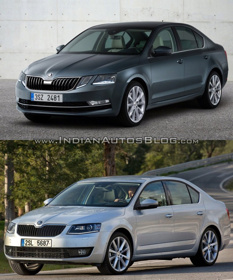
The 2017 Skoda Octavia was digitally unveiled today, giving a first look at the changes introduced in its mid-cycle facelift. Here's a pictorial comparing the facelifted Octavia and the outgoing model.
Exterior:
Not a lot is different on the exterior of the new Skoda, although the changes introduced have lent a slightly different look to Skoda's mid-size sedan. While the previous car had an angular pair of headlamps, the facelifted Octavia features a new quartet of headlights powered by LED technology, giving its face a very unique appeal.
Keeping the two side by side, you can also notice that it has a slightly revised grille and a redesigned bumper-wide intake with new foglamps, and an updated LED taillight cluster. Otherwise the profile and rear-end look identical to the outgoing model.
Interior:
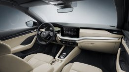
Inside, most of the changes are limited to equipment upgrades. The only noticeable cosmetic change is the instrument cluster, which features dials that look similar to the ones in the Skoda Superb, and a new multi-info color display.
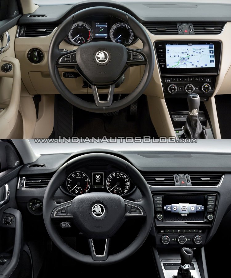
The top-end variant comes with an all new 9.2-inch capacitive touchscreen display with Columbus navigation, which takes up a large chunk of space and reduces the number of buttons in the center console. Other new features include ŠKODA Connect with Infotainment Online and CareConnect, customizable key settings, heated steering wheel, folding tables on the back of the front seats and PET bottle holders.
