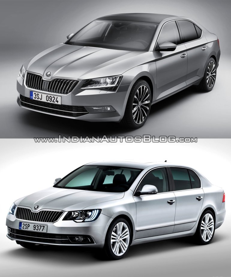
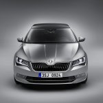
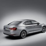
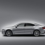
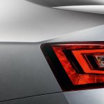
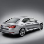
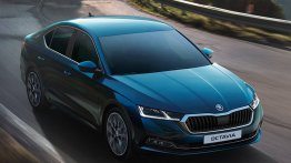
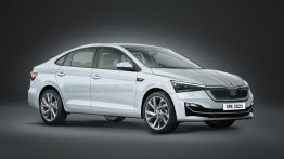
Larger and more spacious than before, the recently unveiled 2016 Skoda Superb is also sharper-looking. Based on the VisionC Concept, the new flagship sedan has its increased size hidden beneath a well-sculpted and dynamic looking exterior.
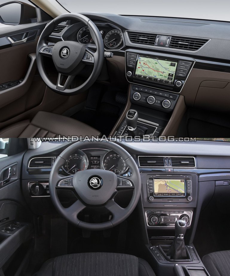
Here we compare the newcomer with the currently serving model.
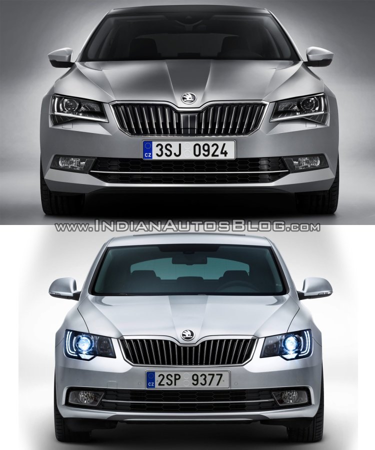
At the front, it's as if all the curves were replaced by sharp lines. The lights and the bumper are sleeker, the grille larger, and the overall look suggests a more aggressive character.
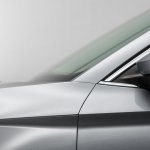
The side profile benefits from a very prominent shoulder line, and the glasshouse is more coupe-like.
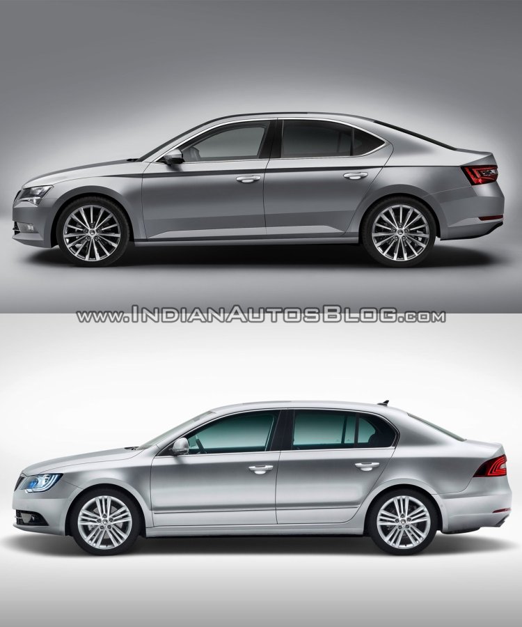
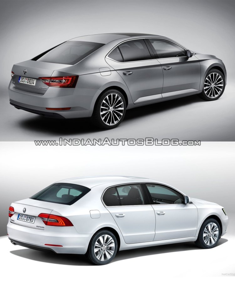
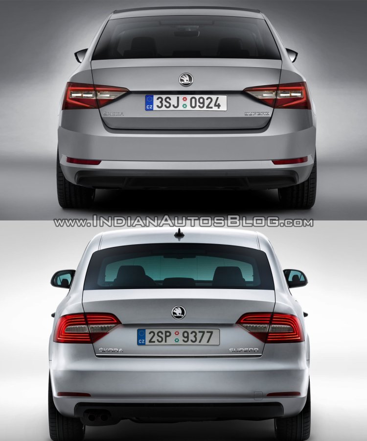
The rear windscreen has grown in size and appears to be raked steeper, while the C-pillar accentuates the coupe-like flowing roofline.
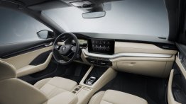
On the inside, while the old car was in no way lacking in quality, it could have appeared boring to some. The new car manages to lose that image with a full redesign that includes an overhauled dashboard.
