The iconic circular Škoda logo with the winged arrow was first registered as a trademark at the patent office in Pilsen on 15 December 1923. Since its initial appearance on vehicles from Mladá Boleslav in 1925, the logo has only undergone a few modifications, with its original visual concept remaining practically unchanged. In August 2022, Škoda Auto introduced a comprehensive update to its corporate identity and also redesigned its picturemark. Aimed at improving visibility on digital platforms, this revamp ensures a more impactful look, especially on mobile devices. Learn more about the evolution of the Škoda logo on the Škoda Storyboard.
The Škoda logo has adorned the Czech automaker’s vehicles worldwide since the 1920s. Today marks the 100th anniversary of its first registration on 15 December 1923 at the Pilsen patent office.
Inspired by history, now a global hallmark of quality ‘made in Mladá Boleslav’
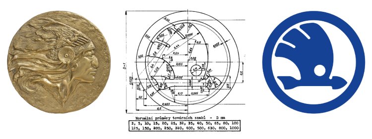
The winged arrow is believed to have stemmed from a competition announced by the Škoda brand’s Technical Director, Dr Ing Vladislav Sýkora, while the idea itself is attributed to Tomáš Maglič, the then commercial director of the company. Maglič was reportedly inspired by a relief on the wall of his office depicting a Native American man with a distinctive headdress. However, the final form of the logo is the work of a professional.
Historical sources suggest that renowned Czech sculptors Otakar Španiel or Otto Gutfreund may have contributed to its design, though their involvement remains unverified. Ultimately, two versions of the winged arrow were created – one with five feathers and the other with three. Both were registered as trademarks of the Škoda company on 15 December 1923 at the patent office in Pilsen.
However, the graphically cleaner and visually simpler design with three feathers above the flying arrow soon became the preferred choice. Initially, the logo appeared on locomotives manufactured in Pilsen; it wasn’t until the 1925 merger with the carmaker Laurin & Klement that this emblem was also featured on vehicles from Mladá Boleslav.
The meaning behind the logo
The Škoda logo embodies the brand’s commitment to high technical and aesthetic standards, and precise manufacturing, as well as symbolising the dynamism of forward motion. Each element of the logo reinforces this message: The large circle represents the global reach and impeccable nature of Škoda’s production, while the wing denotes technological advancement, the range of production, and global distribution.
The forward-pointing arrow signifies progressive manufacturing processes and efficiency, while the smaller circle, reminiscent of an eye, symbolises the precision of Škoda’s engineering, expertise, and foresight. The winged arrow has historically been used on cars, genuine parts and Škoda’s information and communication materials. Remarkably, it has only undergone five noticeable modifications and colour variations in 100 years.
Subtle changes over the century
In its original form, the logo had a metallic base, hence the use of silver and blue. In the 1950s and 1960s, the logo also appeared in red, and was frequently paired with the Škoda wordmark. Between 1993 and 1994, the blue colour was replaced by green.
At the same time, the surrounding circle was expanded to accommodate the Škoda Auto lettering. However, this iteration was short-lived: in 1994, the logo evolved to a more sculpted look, with the outer green circle becoming black, while the green winged arrow emphasised the brand’s commitment to the environment. The logo on the vehicles incorporated the Škoda wordmark and a laurel wreath at the bottom of the surrounding circle.
In 2011, the design was replaced with a modern, lighter variant featuring green, silver, and black elements. In 2022, Škoda introduced a significant update to its corporate identity, the most radical change in 30 years. The refreshed logo enhances the brand’s appearance on digital channels, especially on mobile devices and offers greater flexibility across various formats.


