I’m a fan of the old Tata Safari’s looks but was not really enthused after seeing the first pictures of the Tata Safari Storme.
[Flat nose gets inspiration from Land Rovers; Dual exhaust pipes save the otherwise MPV like rear]
We saw the Safari Storme in flesh at this year’s New Delhi Auto Expo and couldn’t help thinking that Tata could have done better with the styling of the new SUV, considering that it’s actually not just a facelift but is a totally revamped animal under the skin.
However, Tata justifies that the huge fan following for the previous iteration will be kept happy with the new car’s design.
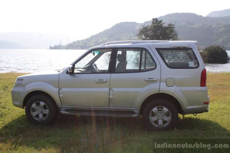
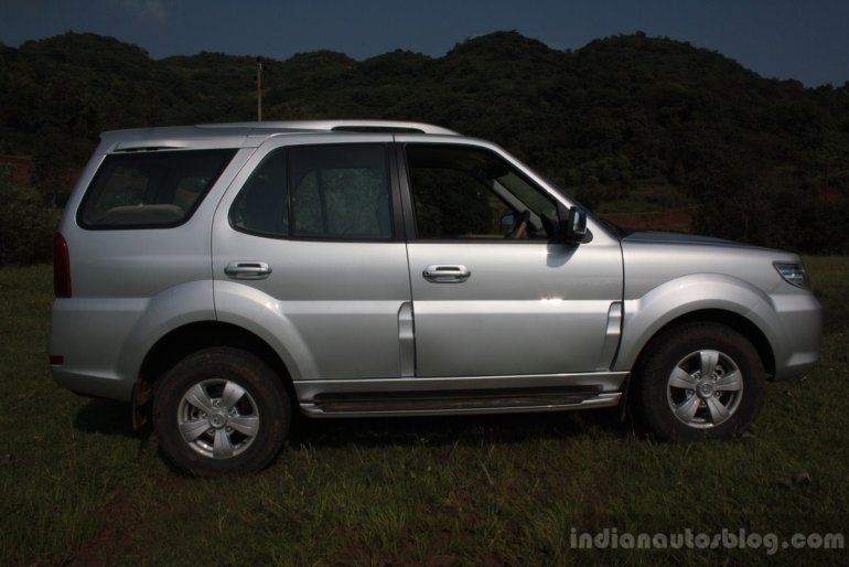
[The Safari's profile gets very few changes, some of the curves have been straightened]
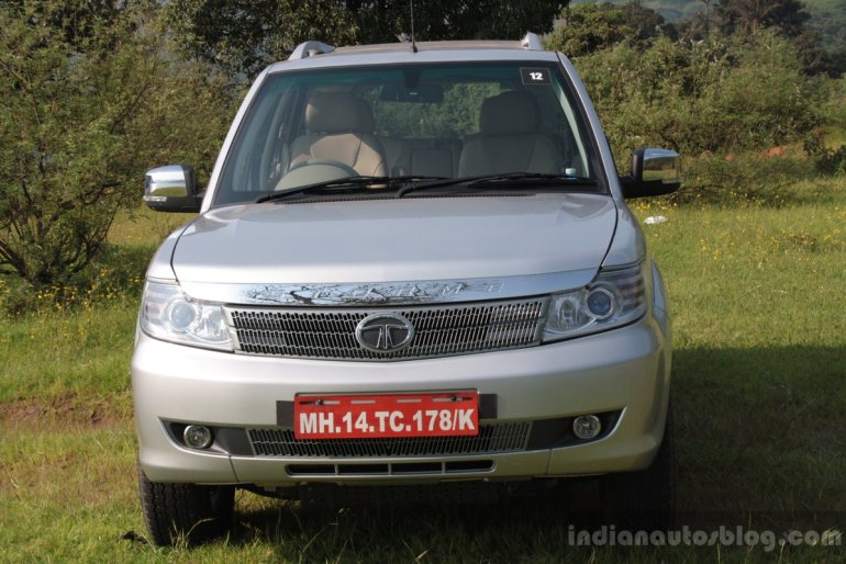
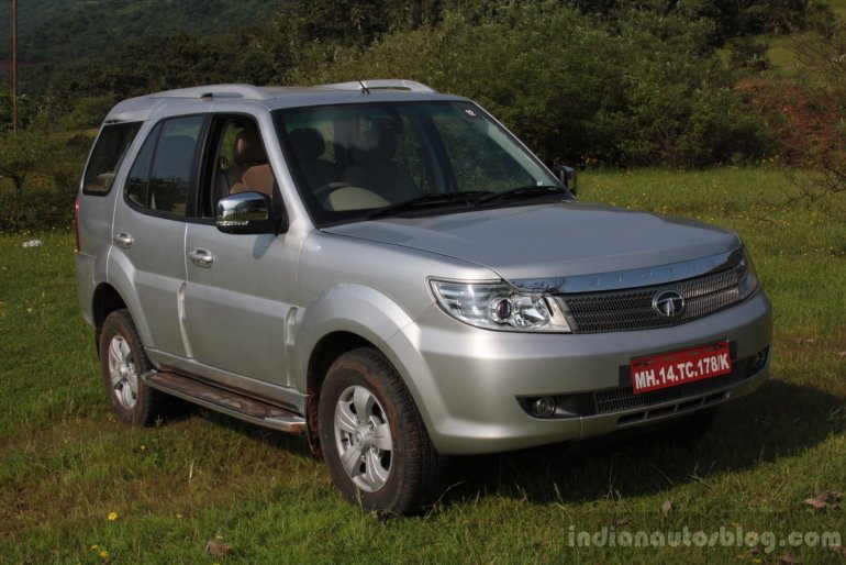
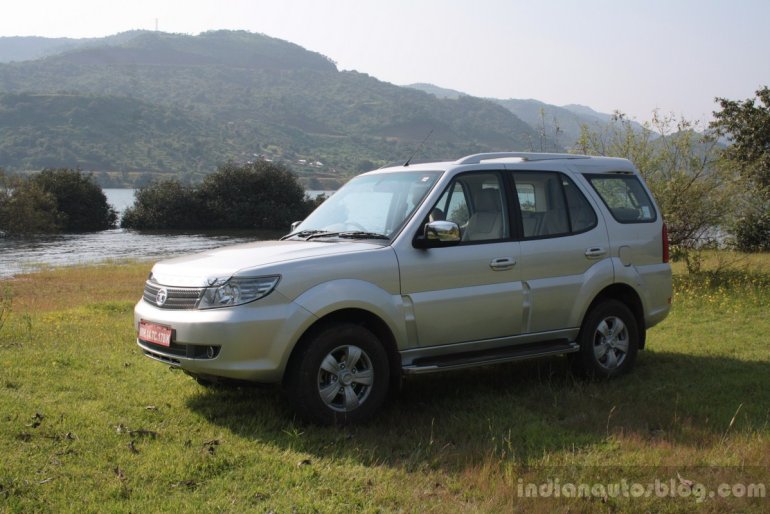
Let’s start with the front. The fact that the Tatas own Land Rover is inevitably evident from the way the face is styled. The flat and square-ish nose and the way the surfaces meet each other perpendicularly is a typical Range Rover thing and that certainly enhances Safari Storme’s appeal as an off-roader. The flat bonnet gets a rectangular bulge to break the monotony but it’s so subtle that it hardly gets noticed.
[The Storme looks best when viewed from these angles]
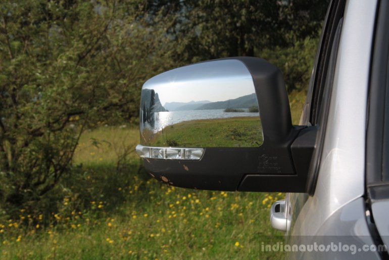
The bold headlamp cluster with HID bulbs, prominent chrome strip with ‘Storme’ etching and the unique meshing for the grill and the lower air dam earn brownie points for styling, they also add to the character, but the fog lamps are a tad too small for an SUV of this size. The wing mirrors come with chrome embellishment and bear LED turn indicators.
[The rear looks taller than it actually is, thanks to the missing spare wheel]
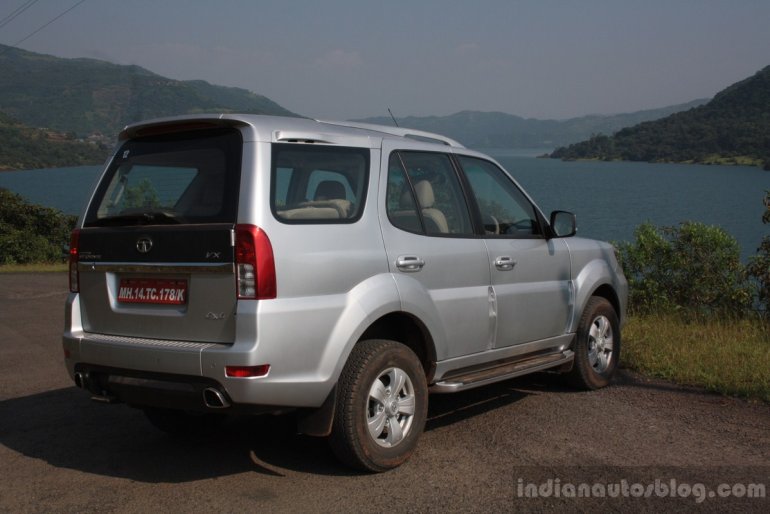
The profile cannot be mistaken for anything other than a Safari and while it’s still nice to look at, people are familiar with the more-than-a-decade-old design and might want something new from an SUV which has its eyes set on Mahindra XUV500. The wheel arches are flared better than the old Safari and blend in very well with the bulged lower half of the body work. The five spoke alloy wheels look mild and suggest nothing of the Storme’s off road capabilities.
[The fog lamps are funky but small; HID bulb aids looks]
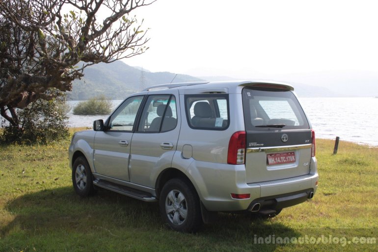
Coming to the rear, I most definitely miss the tail gate mounted spare wheel. The Safari Storme loses a chunk of its macho appeal with the spare wheel being taken away from its butt and relocated underneath the luggage bay.
[The mirror gets chrome treatment; 'Strome' badge takes pride of the place]
As a result, the rear fascia looks tall and narrow – the attributes one usually associates with an MPV – and that’s not a good thing for Storme. The relocation might’ve made the lives of the engineers easy but not that of the customers’ since you need to get your hands dirty every time you encounter a flat tyre.
[5-spoke alloy wheels look simple; Accessing the spare wheel which is located under the luggage bay can become a handful]
The area between the rear windshield and the chrome strip has been blacked out in an attempt to mask the visual bulk, the simple tail lamps reward functionality but doesn’t help the appearance. The stylish twin exhaust tips that are housed within the diffuser style black plastic cladding and the roof spoiler are nice touches though.

The Tata Safari Storme’s styling is a refinement of the existing Safari rather than a dramatic makeover. And after spending a full day of watching nothing but a fleet of Safari Stormes zipping up and down the scenic roads of Lavasa, I could safely say that the design would grow on you, if you already are a fan of the current model.
