 Back when this year started, all manufacturers their 2012 Auto Expo presence was grander than the competition. However, Fiat India, suffering from massive decline in sales in the year 2011, was thinking otherwise.
Fiat India did not choose to participate in the Auto Expo but decided to update its existing lineup Linea and Punto with some very interesting features.
While the updates to the Linea are something one can count on your fingertips, we have never reviewed the Linea before. So we decided to do a comprehensive review of the Fiat Linea from grounds up. Interestingly, first up is the biggest USP of the Linea – exterior design review.
2012 Fiat Linea review - Exterior design
Our regular readers would be aware that Fiat is testing a facelifted version of the Linea which might look like this. Yes, the Linea is pretty old and the current Linea was actually launched way back in 2007.
The Linea was designed by Fiat’s own design house called ‘Centro Stile’ in Italy. Centro Stile philosophy of making cars was ‘practicality first’. However, Linea was a fundamental shift for this design house because it was specifically ordered to be ‘design first practicality later’.
Technically, the Linea is actually a D segment sedan at C+ segment price. It is 4.56 meters long, 1.73 meters wide, 1.5 meters tall and has a wheelbase of 2.6 meters. It uses an extended Grande Punto platform but somehow does more justice to the platform than the Punto. The Linea is a perfect example of the saying ‘Simplicity is the ultimate Sophistication’ and here is why.
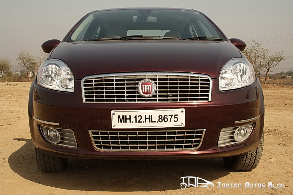
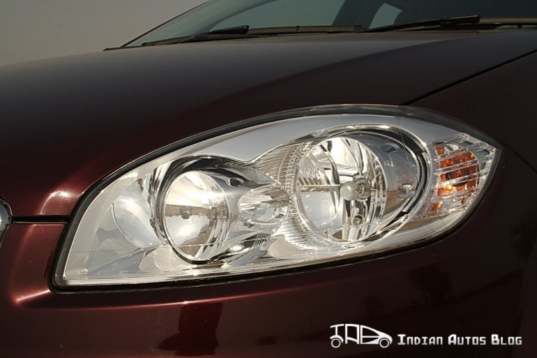
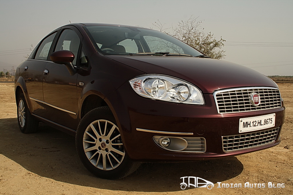
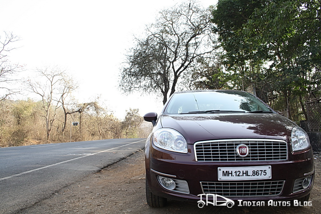
The front of the Linea has a classic Italian flair with those rounded, double barrel headlamps. The rounded snout with a chrome garnished grill make it look elegant and sophisticated and stylish. The silver surrounds of the foglamps go very well with the chromed up front fascia. The rounded nature of the front fascia is result of pain stalking analysis of pedestrian safety and crash safety regulation.
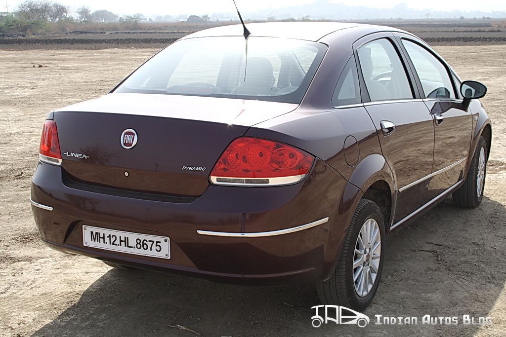
Coming to the side, the simplicity of the side profile takes your breath away. A single character line which starts from the middle of the wheel arch and dissolves into the rear, emphasizing the car’s dynamic look.
The side of the car gives the biggest update to the Linea 2012. Because of customer complaints of the Linea’s ground clearance being an issue on Indian lunar roads, Fiat India has boosted the ground clearance to 185 mm. Yes, the gap between wheel arches and the tyres does take away something essential from the Linea’s exquisite design but benefits are immense and we will find out in the driving review.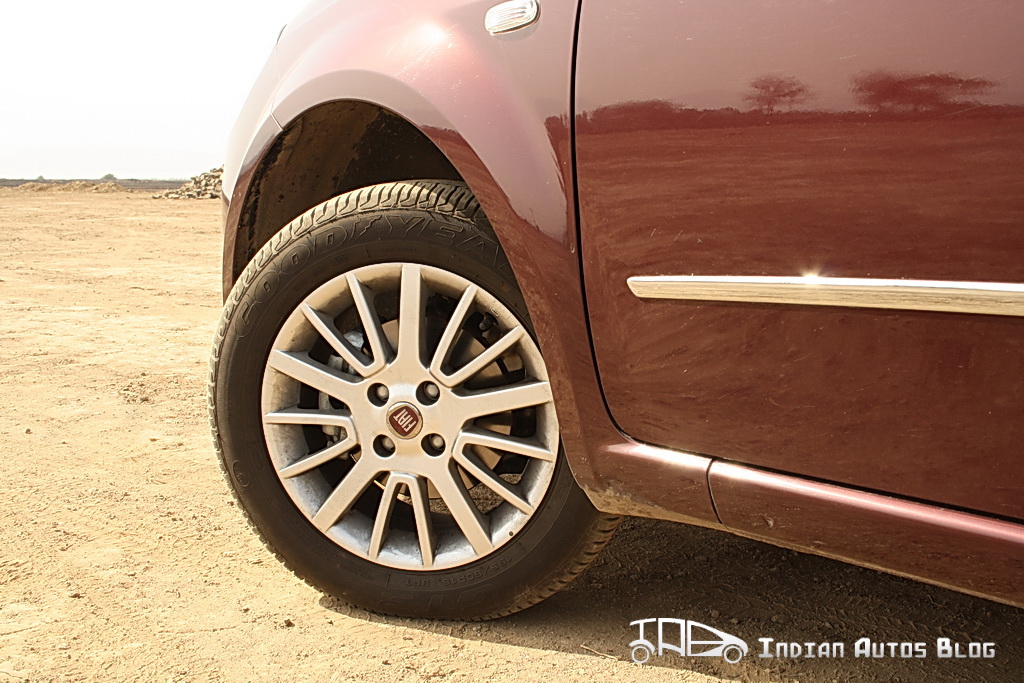
The Linea multi-spoke 15 inch alloy wheels with wider 205/55 tyres look small because of the gap that been created to raise the ground clearance. The longer rear door and the slope of the roof is carried over beautifully to the rear of the car.
The OVRMs provide good visibility out of the car. Unfortunately, they only electrically adjustable and not electrically foldable.
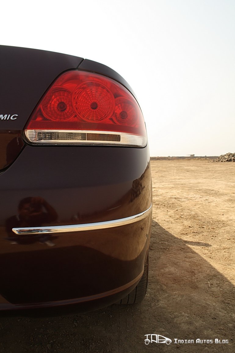
Coming to the rear, you realize why the Linea is referred to as the layman’s Aston Martin. The Linea has an exquisite back-end which is sort of like a perfect heart shaped butt. The all red tail lamps have been contoured with white reverse parking lamps. Little strips of chrome further enhance the beauty of the car.
While it is very difficult to enhance the current design of the Linea, I am going to take a leap of faith. Fiat should think of providing turn indicators on the OVRMS to make the Linea look more up market. Also, the radio antenna on the roof could be fixed in one of the pillars.
The Linea is a design that one can endlessly discuss. It has a very human appeal to the way it looks. It elegant yet sporty, calm yet aggressive and stylish yet simple. The design itself is very versatile, you can take your girlfriend to a fine dine and then just head to the race track and design wise the Linea would fit every occasion. Very few cars can pull that off.
Stay tuned for the interior review and driving impressions
